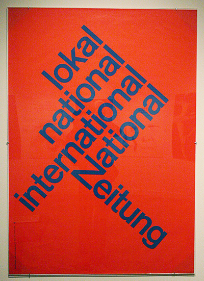
p. 22 Image 162 - In this image we see a simple sans-serif font, seemingly Helvetica, most of the text is angled upwards at a 45 degree angle. However there is a contrasting line of text at a -45 degree angle downwards. I have seen this effect in a lot of modern posters and found it really intriguing to see this original document from 1960. It has a great effect and really draws a lot of attention to the text and its alignment.
p. 18 Image 130 - In this image we see a really lovely hand rendered font with a lot of floral like/ swirly accents around the text. These curls and swirls really pull together the type that has the swashes off of the letters like the "L" and "S". I really like how the letters are similar but not identical.
p. 21 Image 156 - In this image we have a a custom typeface that follows some of the anatomy of a human figure. This was done for a Film poster or title and I really liked the look of it. The layering and hierarchy of the type make it easily legible, the eye follows the words in the way the designer wants. I really like when text takes up a space (like a human or building or something) that it normally doesn't. Even though this isn't a great example it reminded me of things we looked at in class where words and text made up entire profiles of people. Cool stuff.


No comments:
Post a Comment