Weight of type was talked about in chapter 4 saying that if a word is too thin or too thick it can effect legibility. It stated that thin typefaces can't be distinguished from their background, while typefaces that are too thick end up getting lost in their internal pattern of counterforms. I found the effect of colors on typefaces to be particularly interesting. In order to have good contrast and a successful typeface that uses color a designer has to consider a colors hue, value, saturation. The book stated that Typographic textures and tones are affected by the spacing of letters, words, and lines. Therefore, when the spacing between all of the above is the same throughout a whole document the text is much easier to read than a document that had different types of spacing. Not only does spacing affect legibility in a typeface but capital and lowercase case letters also affect legibility. If a text is in all capital letters a viewer will lose interest and get lost in all the capitals and it will take away from legibility. Having all lowercase also affects legibility because then a user is worried about trying to find where one sentence ends and another begins. This is why in order to have a successful and legible document a person needs to use both forms. Going off lowercase and capital letters the character width also affects legibility. Usually a font that is really condensed is much harder to read than one that is not. But at the same time, a person should not use characters that are distorted too horizontally because that effects how people read it as well. One aspect that we touched upon in class that the book went over was anti-aliasing type for Internet use. This is when the computer places pixels on a jagged edge of a text in order to smooth it out more, and make it seem less blocky.
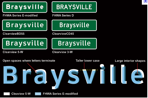
I feel as if the picture above goes well with chapter 4 because it shows all the different style of the Braysville font and shows the differences between each.
No comments:
Post a Comment