2.
3.
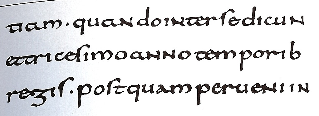
When looking through Chapter 1, I noticed a lot of interesting things. The first thing that I noticed was picture 27. This image shows Caroline Minuscules, which became the standard from the 8th to 12th centuries allover Europe. This font became the standard so that the Roman Alphabet could be read and recognized by people in different regions. Religious and Education texts were written in Caroline Minuscules because it was easily recognizable. The next thing I noticed was picture 29. This is an image of Early Gothic lettering. Early Gothic was a transitional style between Caroline Minuscules and Textura. It was used in the German language and has "an increased vertical emphasis." Last, I noticed image 94. This shows a wood type poster by Davy & Berry. In the 1830s-1880s, wood type posters were extremely popular in both America and Europe. The introduction of wood type fonts had a significant impact on poster design.

When looking through Chapter 1, I noticed a lot of interesting things. The first thing that I noticed was picture 27. This image shows Caroline Minuscules, which became the standard from the 8th to 12th centuries allover Europe. This font became the standard so that the Roman Alphabet could be read and recognized by people in different regions. Religious and Education texts were written in Caroline Minuscules because it was easily recognizable. The next thing I noticed was picture 29. This is an image of Early Gothic lettering. Early Gothic was a transitional style between Caroline Minuscules and Textura. It was used in the German language and has "an increased vertical emphasis." Last, I noticed image 94. This shows a wood type poster by Davy & Berry. In the 1830s-1880s, wood type posters were extremely popular in both America and Europe. The introduction of wood type fonts had a significant impact on poster design.
No comments:
Post a Comment