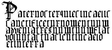
The first thing that jumped out at me while skimming chapter 1 was picture 31, which is a large sample of thirteenth century gothic textura quardarta. This seems to be the earliest appearance of something similar to modern type, with almost all of the letter utilizing serifs. this type appears very similar to blocked out calligraphy.
Photo 54 also caught my attention, as it is the letter B laid out over a grid to show how the letter is formed. It is interesting to see what sort of reference is used when scaling the two loops of the "B" as well as how the serifs and the rest of the letter sit in relation to the center point of the letter.
The last thing I noticed was an example of a block letter "L" drawn with three dimensions in perspective. What interested me was the date of 1836. The letter looks much the same as it would if redrawn today, which seems strange to me just because I'm used to seeing things look drastically different after one hundred and seventy five years.
No comments:
Post a Comment