
Thursday, November 17, 2011


7...Well 4 Deadly Sins Video
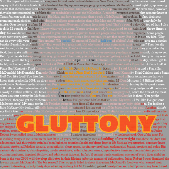
This took me so long that I had to cut the sins to 4 to be able to do the project in time. Hope you enjoy what I have! :)


Wednesday, November 16, 2011

Tuesday, November 15, 2011


Thursday, November 10, 2011


Monday, November 7, 2011


Tuesday, November 1, 2011
Response to Chapter 6
I loved this Chapter. I am such a visual person and always read too much into things. I am the kind of person who looks at something, forms an impression, but can't explain why. It's because I pick up on visual cues.
I found it interesting that the understood use of this element came from the dadaist movement, simply because, I hate dadaism. I did a dada project once where we used magazine images to create a piece, and I found nothing inspiring about taking someone else's art to make my own. There are exceptions, but it's not my favorite concept. Therefore, I was surprised just how much I love the idea of taking premade fonts to create something new. Maybe the pictures was simply too abstract for my taste.
Font, on the other hand, to me is like paint, picking colors to make a whole, or choosing red to convey anger. Fonts do that too. I also love the way font is naturally dry, or maybe much more cognitive, while images are emotional. Too many words are so easy to glaze over and they go unread, but images are hard coded in us to impact us stronger than words. Therefore by adding an image within your font, you are engaging 2 parts of the brain, and creating a more memorable piece.
I loved the example of the E's being splintered or peeled. Action verbs like that are so powerful in and of themselves, and by having the font act it out, you can literally see the action, and it becomes so much more alive. It invokes an emotional response as well, leaving you wondering, why is it peeling, is it old, or is it edible? Or why is it splintered, was it attacked, is it weak and injured, was it broken in a dangerous situation? The mind lingers on scenes it associates with that verb, and it impresses upon them much more that a simple plain E would have done alone.
People respond so much more to this kind of art as well. A simple word, when done right, leaves the reader chuckling and saying, "ahhh, that's clever!"

Subscribe to:
Posts (Atom)