Chapter 5
Chapter five went into one of my favorite topics about typography and design in general, the usage of grids. Grids can offer a lot in the design world. They can help aesthetically, they can be used for organization, they can also be used to help simplify as well as add complexity. Grids are incredibly fun to work with in design as they have been a more recent design obesession of mine. Reading this chapter and learning more about space, edges, boundaries, zones etc. reminded me of something often used in web design/development to reflect a grid. There are multi-column grid systems built to reflect mathematical calculations for laying out web pages into a grid. Here is a picture to show you what I mean:
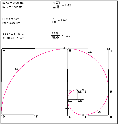
The use of space, hierarchy, boundaries all work to create a final web page that has organization through clear lines, columns, boarders etc. Different grids and columns will seem more active depending on their placement and hierarchy. Using a grid only helps so much; a designer has to also have an understanding of proportion as this chapter mentions. Realizing where things are in the space and how they occupy it with their size and weight can be a very crucial thing to have in the design world. Proportion has a lot to do with the ratio of objects and elements on the page and in type. The more precise proportions are the more clear, clean, and organized the final product will be. The idea of these "ratios" kept bringing up the idea in my mind of the golden ratio. We touched on it in class but it is still something that is fascinating and can also be applied to the design world because it is used in the making of grid systems and other design like architecture, product engineering, web design and typography. For anyone who may not know what the golden ration is, here is one of the more common photos you will find that describes it (even though it is very complex beyond the image alone):
In conclusion this chapter really touched on a lot of the aspects of design that really excite me personally. Reading these things sends me off on tangents finding and researching design techniques and practices. I really enjoyed further exploring the grid and the idea of space in the grid and in type. I look forward to expanding on this in class.


No comments:
Post a Comment