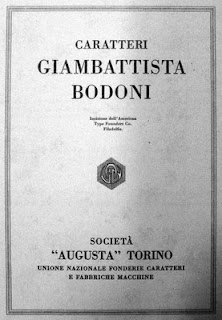
The first image I have chosen to discuss is number 82 from the "Typography from Gutenberg to the nineteenth century: A.D. 1450-1800". The series of "Bodoni" typefaces was designed by Giambattista Bodoni in the late 18th century. The typeface is strong with hairline serifs. I think the simplicity of the font is what caught my eye while I was scanning the pages. It reminds me of something that we e found on an old playbill, or program for an opera. I think the use of a hairline serif accentuates the strength of the columns in each character.
The next image I chose is number 94 from "The nineteenth century and the industrial revolution: A.D. 1800-1899" timeline. It is an image of your basic poster printed with wood type. The eye is automatically drawn to the bold serif fonts. Wood type production was invented during the industrial revolution and changed the aesthetic. I like the way these posters look because the juxtaposition of huge type and tiny type--although it is very dense, it is still visually balanced.
For my final image I chose number 209 from the "A new century and millennium begin: 2000" timeline. This image is hard to miss. It is a poster that was created by Max Kisman. I think this is especially important to this timeline because it shows how innovative people are becoming when it comes to type. The letters in this poster were created by the shapes from other objects--which requires a different way of thinking. I like that most of the images from this timeline choose to creatively use the white/negative space.


No comments:
Post a Comment