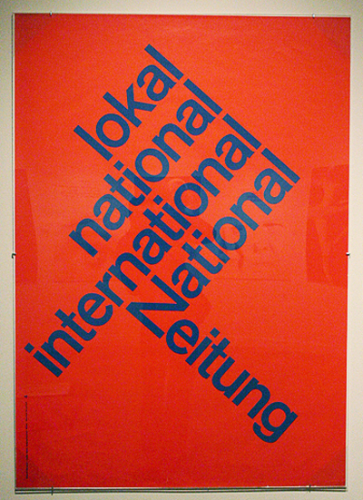
Chapter 6 is about the Typographic Message, a multidimensional language. The typographic message is verbal, visual, and vocal. As a representation of verbal language, typography must communicate clearly. A lot of times, prolific messages are very apparent and litter the environment. The impact of an effective typographic message cannot be measured. Effective typographic messages result from the combination of logic and intuitive judgment. Only the neophyte approaches this process in a strictly intuitive manor; a purely logical or mechanical procedure undermines human expression. Keeping these two extremes in balance requires the use of a functional verbal/visual vocabulary capable of addressing a broad spectrum of typographic communication. Signs operate in two dimensions in a language: syntactic and semantic. All objects in the environment can potentially function as signs, representing any number of concepts. Signs may exist as various levels of abstraction. The particular syntactic qualities associated with typographic signs determine a specific meaning. A series of repeated letters can represent motion or a small letter can mean isolation. Simple syntactic manipulations, such as the repetition of letters or the weight change of certain letters enable words visually to mimic verbal meaning. Words as verbal signs, grouped together in a linear fashion, attain their value though mental association. These associative relationships are semantically derived. Two terms important to the understanding of signs are denotation and connotation. When considering the meaning of typographic signs, denotation refers to objective meaning and connotation refers to interpretations. Chapter 6 then goes on to talk more about how typographers have a responsibility to keep words legible and functional.

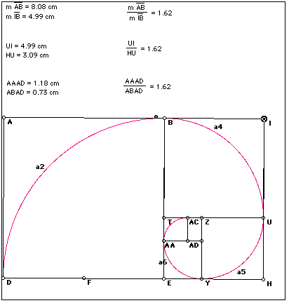
Chapter five focuses on the importance and meaning of the typographic grid. It explains that space is the common denominator for all typographic communication. When typographic elements are introduced into space, they create subliminal divisions, and these divisions create spatial structure. Divided space is perceived as a system of proportional relationships. One must understand that the typographic grid is a system of proportions. A grid ratio is a mathematical relationship between two or more grid measurements and it governs the size and placement of typographic elements. The natural division of the golden section is the basic square. Squares in combination lend an infinite variety of visual patterns. Squares basically will never go out of style because Paul Rand used them as metaphorical building blocks. They seem to be forever-contemporary. Before any decision is made about the typographic structure, a designer must become thoroughly acquainted with the amount of text, its content, the audience for which it is intended and the medium used for its delivery. Grid structures will often require adjustment throughout the design process. Multi-column grids are unique in that they provide boundaries for typographic elements and define the “active” space of the page, which creates a dominant axis for the alignment of elements from page to page. Modular grids are formed by the intersections of horizontal and vertical lines. The units provide zones for the placement of different parts of information. In general, the more complex the grid structure is, the more flexible the organizational possibilities. Improvisational structures evolve in response to the specific elements of information as opposed to modular grids, which are predetermined organizational grids. Typographic designers build typographic information environments for clear and accessible information. Once it is known which elements are more important than others, they are translated into typographic forms reflecting their hierarchal status. Working with improvisational structures call for a firm understanding of asymmetrical composition, the dynamics of positive and negative space, and the essential role of visual contrast among typographic elements.
 The main reason I chose this image from Chapter One is because it is hand rendered and includes illustration. The C taking on the form of a mouth allows the word to be seen as an image in a whole, not just letters. It conveys the message of racism, which is vicious and tearing and messy, with the expressive lines and smears.