Tuesday, October 11, 2011
Thursday, October 6, 2011
Chapter 1: Images and Responses
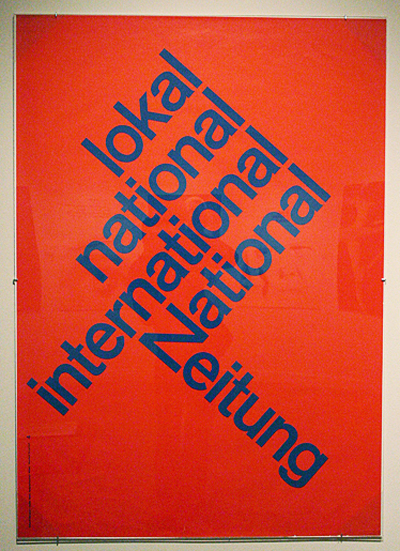
p. 22 Image 162 - In this image we see a simple sans-serif font, seemingly Helvetica, most of the text is angled upwards at a 45 degree angle. However there is a contrasting line of text at a -45 degree angle downwards. I have seen this effect in a lot of modern posters and found it really intriguing to see this original document from 1960. It has a great effect and really draws a lot of attention to the text and its alignment.
p. 18 Image 130 - In this image we see a really lovely hand rendered font with a lot of floral like/ swirly accents around the text. These curls and swirls really pull together the type that has the swashes off of the letters like the "L" and "S". I really like how the letters are similar but not identical.
p. 18 Image 130 - In this image we see a really lovely hand rendered font with a lot of floral like/ swirly accents around the text. These curls and swirls really pull together the type that has the swashes off of the letters like the "L" and "S". I really like how the letters are similar but not identical.
p. 21 Image 156 - In this image we have a a custom typeface that follows some of the anatomy of a human figure. This was done for a Film poster or title and I really liked the look of it. The layering and hierarchy of the type make it easily legible, the eye follows the words in the way the designer wants. I really like when text takes up a space (like a human or building or something) that it normally doesn't. Even though this isn't a great example it reminded me of things we looked at in class where words and text made up entire profiles of people. Cool stuff.
CH 1 Image Response
image 109, pg. 15 --- A pack of smoking tobacco from the 1880s. The lettering of this image was printed by chromolithography. Chromolithography is a method of producing multi-colored prints. The process is a chemical one that relies on using a grease-based crayon on zinc plates, then using a gum arabic acid solution and oil-based paints.
image 156, pg. 21 --- "Anatomy of a Murder" film title by Saul Bass. A very noted graphic designer, Saul Bass was one of the first designers to recognize the potential for creativity in title and credit sequences. He has a very distinct style that revolves around the use and re-use of simple cut out, often geometric shapes and few colors. His distinct style can also be seen in the logos of many big corporations such as AT&T, United Airlines, Bell telephones, etc..
image 160, pg. 22 --- peace symbol by Gerald Holton, 1959. Holton originally designed the universally recognizable peace symbol for a British nuclear disarmament movement. The symbol is made up of the semaphore signals for the letters 'N' and 'D'. The 'N' is made by a person holding two flags in an upside down 'V'. The 'D' is made by a person holding one arm straight up and the other arm straight down.
Chapter 1 Response
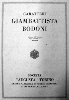
The first image I have chosen to discuss is number 82 from the "Typography from Gutenberg to the nineteenth century: A.D. 1450-1800". The series of "Bodoni" typefaces was designed by Giambattista Bodoni in the late 18th century. The typeface is strong with hairline serifs. I think the simplicity of the font is what caught my eye while I was scanning the pages. It reminds me of something that we e found on an old playbill, or program for an opera. I think the use of a hairline serif accentuates the strength of the columns in each character.
The next image I chose is number 94 from "The nineteenth century and the industrial revolution: A.D. 1800-1899" timeline. It is an image of your basic poster printed with wood type. The eye is automatically drawn to the bold serif fonts. Wood type production was invented during the industrial revolution and changed the aesthetic. I like the way these posters look because the juxtaposition of huge type and tiny type--although it is very dense, it is still visually balanced.
For my final image I chose number 209 from the "A new century and millennium begin: 2000" timeline. This image is hard to miss. It is a poster that was created by Max Kisman. I think this is especially important to this timeline because it shows how innovative people are becoming when it comes to type. The letters in this poster were created by the shapes from other objects--which requires a different way of thinking. I like that most of the images from this timeline choose to creatively use the white/negative space.
Chp 1 Response
Minimalist creation leads to minimalist thought. Minimalist thought means thinking less. If you create something minimalist, your viewers will react to it with a minimalist amount of thought.
Like for instance, have you ever noticed how when you turn on your macbook, it makes a "Duhhh.." sound? That's the sound of minimalism! Minimalism is the lack of thought.
The Bauhaus is full of it. Their idea that simplicity is everything is the antithesis of truth itself. For centuries, people have adorned their writings with generous amounts of ornamentation. This ornamentation is a sign of the creator's warmth and love for what they are creating. Ornamentation is in itself an art form. To say that ornamentation should be removed in the name of simplicity is to dismiss a form of art, which is impossible because everyone knows that everything is art.
In fact, when Steve Jobs died the other day, all people could say was . That's it. Just . I believe, people have lost their will to think beyond !
People wonder today, what comes after Modernism, Post Modernism, Post Post Modernism and Poste Haste Do Not Pass Go Collect $200 Modernism? No one has an answer to this! That is because there is nothing left to remove from what we are creating. We have reached the limits of Simplicity! It is time to add copious amounts of crap to all design in the name of beauty and art! Crap is beautiful. Art schools make lots of it. They know it's beautiful. And they like it.
From this point forward, we as designers should stop thinking simple and add more crap! Complexity is inherent in everything. Life is complex. We should embrace complexity. Complexity is what truly awes people, not the lack of complexity. The lack of complexity just makes people's eyes go glossy, like the smooth surfaces on a Mies Van Der Rohe building.

Subscribe to:
Posts (Atom)


