Monday, September 26, 2011

Found Type

For my Found Type project I decided to do something I am really passionate about.... the automotive world. I will use bits and pieces from some of my favorite cars (pictured below) to create my project.


Chapter 3&4 responses

One thing that the book talked about in chapter 3 that was interesting was how a certain type of line can effect the overall mood. Depending on how thick or thin the line is determines the feel of it, and as the book stated that is in the hands of the designer to determine when the overall effect is balanced. The book also stated the placement of punctuation also effect the alignments of the lines. Typographic hierarchy also seemed interesting and is important in the placement of type. The book stated that visual punctuation is a governing factor in the typographic arrangement. Visual punctuation helps clarify the meaning of the typographic message, as the book stated this is like a writer using punctuation in a sentence. Weight of type was talked about in chapter 4 saying that if a word is too thin or too thick it can effect legibility. It stated that thin typefaces can't be distinguished from their background, while typefaces that are too thick end up getting lost in their internal pattern of counterforms. I found the effect of colors on typefaces to be particularly interesting. In order to have good contrast and a successful typeface that uses color a designer has to consider a colors hue, value, saturation.

Found Type: Album Art & Type

Really like this idea of found type and thought about albums that I am really into or was at some point.  Hope you enjoy.


Found Type - Library Style


I have decided to use book covers for my found type project. I hope the theme is a little obvious at this point. :)


Tuesday, September 20, 2011

EUROSTILE // COURIER


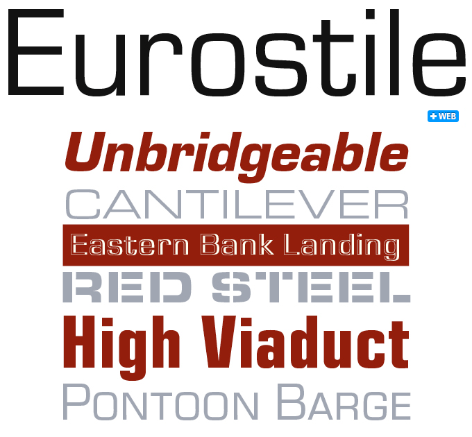
Eurostile is a san-serif typeface, a seemingly contemporary typeface. The Eurostile's curvature on most of it's letterforms give it a very new-wave, scientific vibe. I can see Eurostile gleaming on the front of an obscure party compound full of drug lust and debauchery. The apparent perfectness of the typeface is shown with the geometric styling of all letterforms, seemingly all derived from the letter O. Eurotile's O makes me think of peering through a window of an early NASA orbiter- as the most of the letterforms formulate from the O, it appears that one might be caught in dead space while beaming down on Eurostile. Eurostile would delightfully tag along on Back To The Future's DeLorean DMC-12 while blasting some euphoric electronic music on the ride through time. Eurostile's presentation definitely projects a sense of science fiction and the pristine. Controlled yet state-of-the-art.


The slab-serif typeface Courier is one that is familiar to most, as it has been embodied in a lot of interactive media. Courier is an interesting typeface, as it can be judged as an 'older' font, as its appearance is not unlike a 'typewriter'- it also can be familiarized with early computing, as some may recognize it from PC command prompting or in old videogame on-screen text. It's informative persona is very effective, as the stark serif's provide stability for each letter form, displaying a typeface not to be messed with. I can see Courier all over a briefing letter sitting on a low-lighted detective's office desk. In a different senario- I imagine it flying wildy across a desktop monitor as a computer programmer codes an eccentric calculation application. Courier would look great on the road with an old American made pick up truck, as it grips the concrete with it's heavy load. It could be placed on the cover of a synthesizer heavy industrial record, but also could composed onto a punk record with enough distress onto the typeface itself. Courier seems to be quite versatile.

- Kevin McCaughey

Chapter Two Reading Response


        Reading Chapter 2 of Typographic Design: Form and Communication really shed a new a light on typography.  I have watched movies like Helvetica before even bought the book in my ever going typography interest, yet I still found this to be a very informative chapter on typography and its origins.  The history behind type was much more vast than I ever expected.  Before ever getting into type I always just ignored type really, passing it by without notice, now after being more educated in type you can walk around and type can really speak differently.
        I really enjoyed learning about how much type was influenced by handwriting and how the tools of the past contributed to creating early forms of the alphabet.  I have always enjoyed writing with a pen. I have always believed that my first experience in writing where I knew handwriting was going to be something special to me was when I learned cursive.  I loved the writing aspect of writing, what it said didn’t matter I just enjoyed making words flow and blend.  That is where I believe my earliest love for type developed, so I found it fascinating to read about this and how the tools of writing formed type.  The role of geometry in type has also been something that has interested me.  Things like angles and exact measurements are extremely important when it come to typography.  These things matter in type just like negative space matters, optical relationships between letterforms and words are extremely important.  In art negative space, or the white space in simple text, is extremely important to focus on and address.  
        The more I learn about type the more the more it excites me to do the projects and assignments for this class with this newfound knowledge. All together the chapter was extremely informative and really impressed me with all the new terms and facts that I learned about type.