
Thursday, November 17, 2011


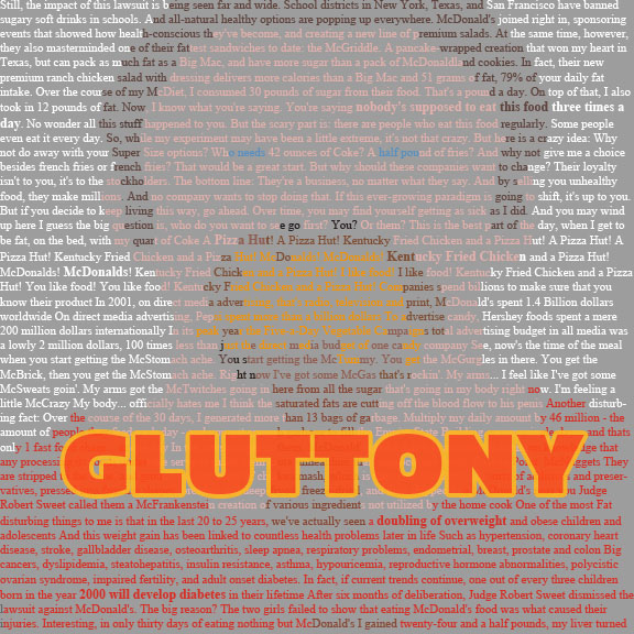
7...Well 4 Deadly Sins Video
This took me so long that I had to cut the sins to 4 to be able to do the project in time. Hope you enjoy what I have! :)


Wednesday, November 16, 2011

Tuesday, November 15, 2011


Thursday, November 10, 2011


Monday, November 7, 2011


Tuesday, November 1, 2011
Response to Chapter 6
I loved this Chapter. I am such a visual person and always read too much into things. I am the kind of person who looks at something, forms an impression, but can't explain why. It's because I pick up on visual cues.
I found it interesting that the understood use of this element came from the dadaist movement, simply because, I hate dadaism. I did a dada project once where we used magazine images to create a piece, and I found nothing inspiring about taking someone else's art to make my own. There are exceptions, but it's not my favorite concept. Therefore, I was surprised just how much I love the idea of taking premade fonts to create something new. Maybe the pictures was simply too abstract for my taste.
Font, on the other hand, to me is like paint, picking colors to make a whole, or choosing red to convey anger. Fonts do that too. I also love the way font is naturally dry, or maybe much more cognitive, while images are emotional. Too many words are so easy to glaze over and they go unread, but images are hard coded in us to impact us stronger than words. Therefore by adding an image within your font, you are engaging 2 parts of the brain, and creating a more memorable piece.
I loved the example of the E's being splintered or peeled. Action verbs like that are so powerful in and of themselves, and by having the font act it out, you can literally see the action, and it becomes so much more alive. It invokes an emotional response as well, leaving you wondering, why is it peeling, is it old, or is it edible? Or why is it splintered, was it attacked, is it weak and injured, was it broken in a dangerous situation? The mind lingers on scenes it associates with that verb, and it impresses upon them much more that a simple plain E would have done alone.
People respond so much more to this kind of art as well. A simple word, when done right, leaves the reader chuckling and saying, "ahhh, that's clever!"

Thursday, October 27, 2011


Tuesday, October 25, 2011
Response to Chapter 5
I still find it so fascinating that something as mathematical in nature as the Fibonacci sequence can be so beautiful. You wouldn't expect nature to boil down to something so re-creatable. Nature itself just exudes a very "real" and imperfect quality, but is actually extremely precise. This shows how even nature uses a grid pattern, and in order to find the nature order it possesses, so do we. The golden mean is biologically appealing to us, and since it so prominent in nature, we are hard wired to prefer and better understand things that follow the same pattern, from faces to shells to page layouts. Things that don't follow this mean, like a person drawn out of proportion, just look...off. Most of us don't realize why when it happens in our daily life, but we just know. Playing with this ratio is the perfect way to subtly convey a message without using words. And whether you want your audience to be aesthetically pleased, or maybe you want to make them visually uncomfortable, keeping in mind the golden mean is key.
I also love the idea of creating a rhythm or a velocity for the page, both in words and in paragraphs. It is true, a letter, based on its position on the page, can imply movement, and I think this is very powerful, especially for very visual people. However, I never realized that the gravity effect on a letter could draw out basic fears and desires, like how it said a tilted letter can imply falling, which evokes feelings about humans' fear of falling. This is such a base instinct, but is completely true. The positioning of the letter dives into our sub conscious and pulls out reactions we don't even know are there until we develop an impression about the piece, and then are left wondering, now why do I feel that? It's amazing how many messages we can pick up just from layout.
I also love the idea of creating a rhythm or a velocity for the page, both in words and in paragraphs. It is true, a letter, based on its position on the page, can imply movement, and I think this is very powerful, especially for very visual people. However, I never realized that the gravity effect on a letter could draw out basic fears and desires, like how it said a tilted letter can imply falling, which evokes feelings about humans' fear of falling. This is such a base instinct, but is completely true. The positioning of the letter dives into our sub conscious and pulls out reactions we don't even know are there until we develop an impression about the piece, and then are left wondering, now why do I feel that? It's amazing how many messages we can pick up just from layout.
Sunday, October 23, 2011
Chap. 6 Response
Chapter 6 is about the Typographic Message, a multidimensional language. The typographic message is verbal, visual, and vocal. As a representation of verbal language, typography must communicate clearly. A lot of times, prolific messages are very apparent and litter the environment. The impact of an effective typographic message cannot be measured. Effective typographic messages result from the combination of logic and intuitive judgment. Only the neophyte approaches this process in a strictly intuitive manor; a purely logical or mechanical procedure undermines human expression. Keeping these two extremes in balance requires the use of a functional verbal/visual vocabulary capable of addressing a broad spectrum of typographic communication. Signs operate in two dimensions in a language: syntactic and semantic. All objects in the environment can potentially function as signs, representing any number of concepts. Signs may exist as various levels of abstraction. The particular syntactic qualities associated with typographic signs determine a specific meaning. A series of repeated letters can represent motion or a small letter can mean isolation. Simple syntactic manipulations, such as the repetition of letters or the weight change of certain letters enable words visually to mimic verbal meaning. Words as verbal signs, grouped together in a linear fashion, attain their value though mental association. These associative relationships are semantically derived. Two terms important to the understanding of signs are denotation and connotation. When considering the meaning of typographic signs, denotation refers to objective meaning and connotation refers to interpretations. Chapter 6 then goes on to talk more about how typographers have a responsibility to keep words legible and functional.
Thursday, October 20, 2011
Chapter 5 Response/Reflection
Chapter 5
Chapter five went into one of my favorite topics about typography and design in general, the usage of grids. Grids can offer a lot in the design world. They can help aesthetically, they can be used for organization, they can also be used to help simplify as well as add complexity. Grids are incredibly fun to work with in design as they have been a more recent design obesession of mine. Reading this chapter and learning more about space, edges, boundaries, zones etc. reminded me of something often used in web design/development to reflect a grid. There are multi-column grid systems built to reflect mathematical calculations for laying out web pages into a grid. Here is a picture to show you what I mean:
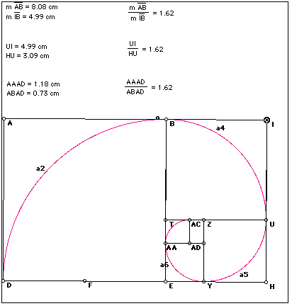
 The use of space, hierarchy, boundaries all work to create a final web page that has organization through clear lines, columns, boarders etc. Different grids and columns will seem more active depending on their placement and hierarchy. Using a grid only helps so much; a designer has to also have an understanding of proportion as this chapter mentions. Realizing where things are in the space and how they occupy it with their size and weight can be a very crucial thing to have in the design world. Proportion has a lot to do with the ratio of objects and elements on the page and in type. The more precise proportions are the more clear, clean, and organized the final product will be. The idea of these "ratios" kept bringing up the idea in my mind of the golden ratio. We touched on it in class but it is still something that is fascinating and can also be applied to the design world because it is used in the making of grid systems and other design like architecture, product engineering, web design and typography. For anyone who may not know what the golden ration is, here is one of the more common photos you will find that describes it (even though it is very complex beyond the image alone):
 In conclusion this chapter really touched on a lot of the aspects of design that really excite me personally. Reading these things sends me off on tangents finding and researching design techniques and practices. I really enjoyed further exploring the grid and the idea of space in the grid and in type. I look forward to expanding on this in class.
Chapter five went into one of my favorite topics about typography and design in general, the usage of grids. Grids can offer a lot in the design world. They can help aesthetically, they can be used for organization, they can also be used to help simplify as well as add complexity. Grids are incredibly fun to work with in design as they have been a more recent design obesession of mine. Reading this chapter and learning more about space, edges, boundaries, zones etc. reminded me of something often used in web design/development to reflect a grid. There are multi-column grid systems built to reflect mathematical calculations for laying out web pages into a grid. Here is a picture to show you what I mean:

Subscribe to:
Posts (Atom)